 Free Online Image Optimizer
Responsive images, and the markup that serves them
One image file cannot be right for everybody. A modern phone browser can read AVIF and would rather have a small one; an older one needs JPEG; a desktop wants the wide version. The answer is to ship several files and let the browser choose, and this page makes the files and writes the markup that does the choosing. Here is the whole thing on one photograph.
Generate responsive images and the picture element →
The page arrives already configured
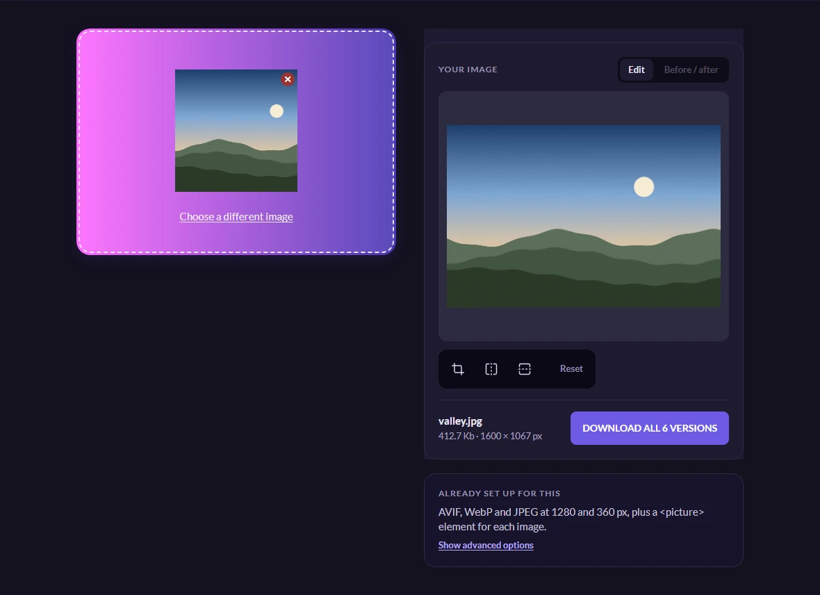
Generate responsive images runs the same tool you get on the front page, with the choices already made for you: AVIF, WebP and JPEG, at 1280 and 360 pixels, plus a <picture> element for each image. That is three formats at two widths — six files — and the panel on the right says so before you start.
You can change any of it under Show advanced options, but the defaults are the common case: a wide version for desktops, a small one for phones, and each in a modern format with a fallback.
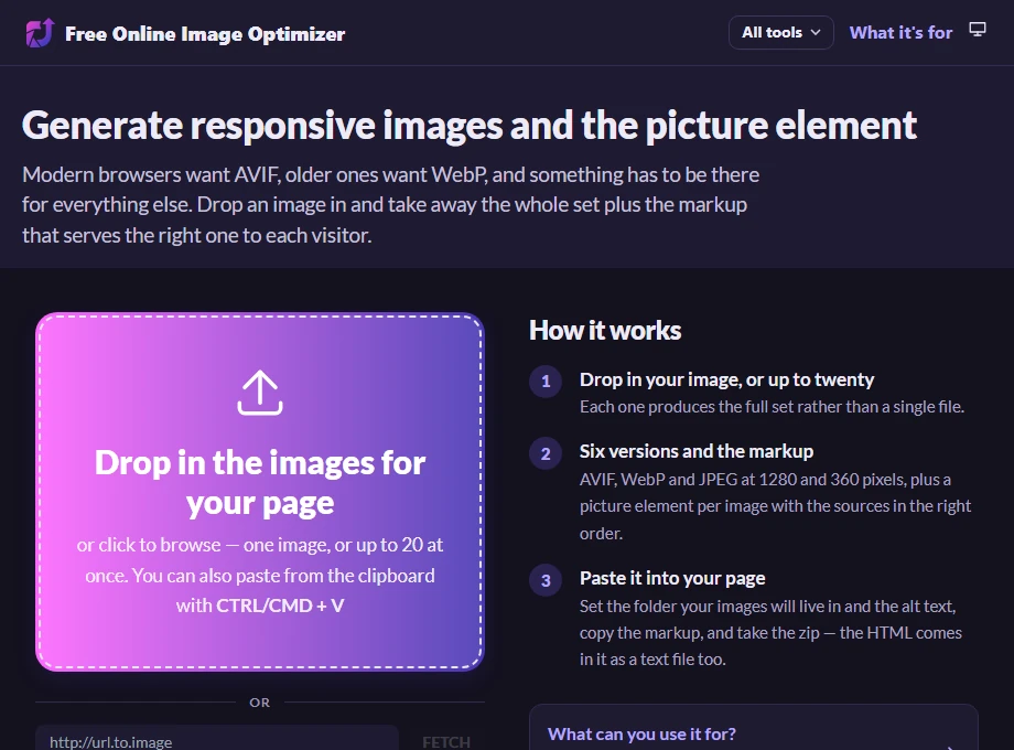
Drop in a photograph
Use the biggest version you have. The tool will not enlarge an image — asking for 1280 pixels from an 800-pixel original gives you an 800-pixel file — so starting from the original rather than something already shrunk is what makes the wide version worth having.
The photograph below is 412.4 Kb at 1600 × 1067 pixels, which the page reads off the file and shows under the stage. The button counts the files it is about to make: Download all 6 versions. If you change the formats or the widths, that number changes with them.
Six versions, and what the sizes tell you
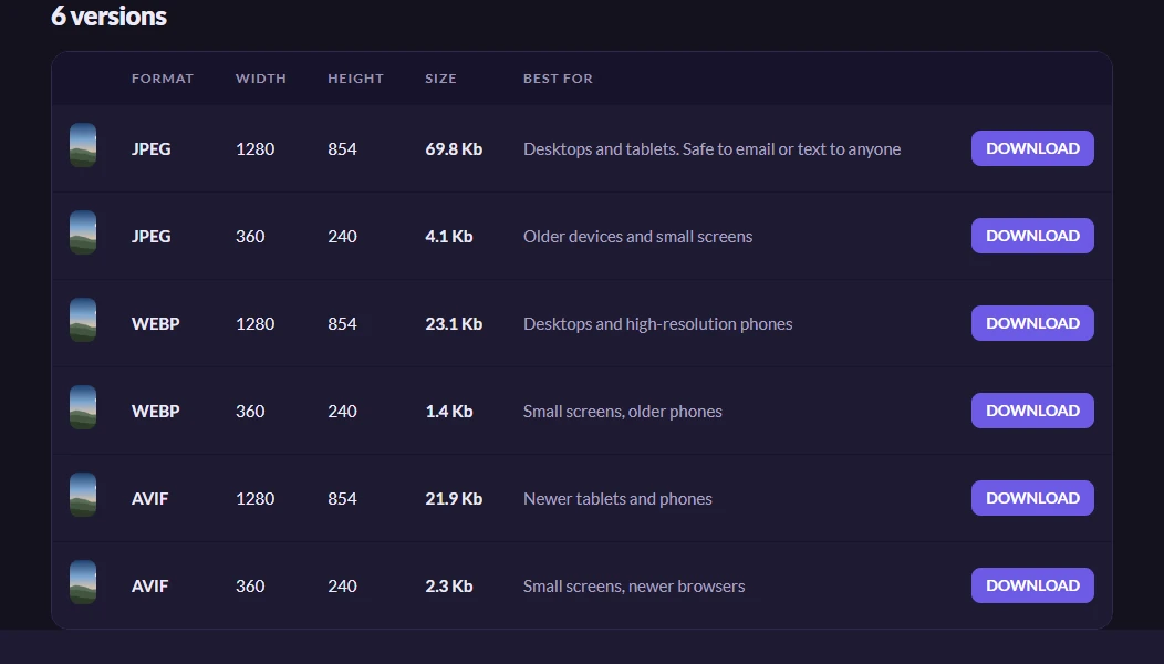
Press the button and the whole set comes back at once, as a zip. The table is worth reading rather than skipping, because it is the argument for doing any of this:
The same photograph is 69.7 Kb as a 1280-pixel JPEG, 23.3 Kb as WebP, and 21.9 Kb as AVIF. At 360 pixels it is 4.1 Kb, 1.4 Kb and 2.3 Kb. So a visitor on a modern phone can be served 2.3 Kb where the naive answer — one big JPEG for everyone — would have sent them 69.7 Kb, and a visitor on something older still gets a file that works.
The widths in the table are measured off the files that came back, not the widths that were requested. That distinction matters in the next step.
Tell it two things, and take the markup
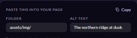
Six files are no use without the markup that picks between them, and the page writes that for you. It needs two things from you first, and both appear with the markup once the versions are back:
Folder is where the files will live on your own site, so the paths in the markup point at them — type assets/img/ and every path is written with that prefix. Alt text is the description of the picture, which belongs in the markup for the people using a screen reader and for the search engines reading your page. Both appear in the snippet as you type, and Copy takes whatever is on screen.
The zip also contains the markup as a text file and as a small working demo page. Those are written at the moment you press download, so they carry no folder prefix — which is what makes the demo page work, since the images sit beside it in the archive.
What the markup does
The result looks like this, and every part of it is doing a job:
<picture>
 <source type="image/avif" sizes="100vw"
    srcset="assets/img/valley_small.avif 360w, assets/img/valley_large.avif 1280w">
 <source type="image/webp" sizes="100vw"
    srcset="assets/img/valley_small.webp 360w, assets/img/valley_large.webp 1280w">
 <img alt="The northern ridge at dusk" src="assets/img/valley_large.jpeg"
    srcset="assets/img/valley_small.jpeg 360w, assets/img/valley_large.jpeg 1280w"
    sizes="100vw" loading="lazy" decoding="async">
</picture>
The browser reads the <source> elements in order and takes the first format it understands, which is why AVIF comes before WebP. If it understands neither it falls through to the <img>, which is the JPEG — and the <img> is not optional decoration, it is the element that actually displays the picture and carries the alt text.
Inside each format, srcset offers the widths and the w descriptors say how wide each file really is. sizes="100vw" tells the browser how much of the viewport the picture will occupy — change it if your image sits in a column rather than spanning the page, because the browser uses it to decide which width to fetch before it has laid the page out.
This is also why the measured widths matter. If the markup claimed 1280w for a file that came back at 900 pixels, browsers would choose the wrong one on exactly the screens this is meant to help.
Worth knowing
Where to put the files
The paths in the markup are relative, so the six images have to end up in the folder you named, relative to the page that references them. If you typed assets/img/, the files belong in assets/img/ next to your HTML. Get that wrong and you see broken images rather than an error message.
Doing a whole folder at once
Drop in up to twenty images and each one produces its own full set and its own <picture> element, with the markup for all of them in one block to copy. The alt text starts as each file's name and can be edited per image before you copy — which is worth doing, because the filename is almost never a useful description.
JPEG, or PNG, as the fallback
The fallback is a JPEG unless you turn JPEG off, in which case whatever is left becomes the fallback. Keep a JPEG in the set: it is the one format every browser in use can read, and it is what the <img> is there for. If your image needs a transparent background, a PNG has to be the fallback instead — the PNG to WebP page explains why the choice is forced.