 Free Online Image Optimizer
Combining a set of photographs into one picture
Sending somebody twenty pictures is awkward three ways at once. Twenty attachments is a bad email. A zip is a thing the person at the other end has to unpack before they can see anything. And neither gives either of you a way to say which one you meant, so the reply comes back as “the third one, or maybe the fourth”. One picture with the whole set on it answers the first two, and a switch for the filenames answers the third when you need it. This walks through making one out of eight holiday shots.
Combine several images into one picture →
Bring the whole set at once
The page is Combine images into one picture. Select everything in the folder and drag the lot over together, or use the picker and multi-select — up to twenty at a time. They stay in the order you handed them over, which becomes the order they appear on the sheet, so if you want a particular shot first, sort the files before you drop them.
Mixed shapes are fine and worth having. The set used through this walkthrough is a portrait, a panorama, a square and some landscapes, chosen precisely because they are not uniform: what happens to an odd shape inside a square cell is the one thing about this tool that could go wrong quietly. The thumbnails in the drop zone are cropped to squares to line them up, so you cannot tell them apart there — the sheet itself is where the proportions reappear.
Nothing has been sent anywhere yet. Picking files stages them; the page waits for you to press the button, which is the same rule every tool here follows.
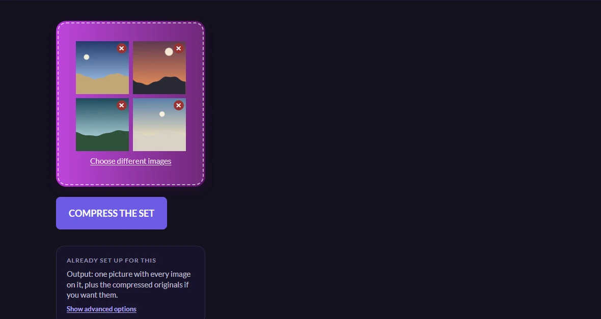
The set is compressed first, and then you watch the sheet build
Pressing the button runs the ordinary batch: every picture is shrunk and listed in a table with its before and after size. You may well want those files too, and the zip button hands them over.
But the compression is also what the sheet is built from, and that is deliberate rather than incidental. A sheet is something you look at on a screen or print on one page; assembling it out of twenty full-resolution originals would produce an enormous file whose extra detail nobody ever sees, and it would take much longer to make. Building it from versions that have already been reduced gives a sheet of a few hundred kilobytes that still shows every frame clearly.
Once two pictures have finished, the sheet appears beside them — not as a description of what you would get, but as the actual picture, with the settings in a column next to it so nothing you press happens off screen. The download hands over exactly the file shown rather than making a second one from the same settings. The two-picture threshold is not arbitrary: a sheet of a single photograph is that photograph with a border around it, which is a worse copy of a file you already have.
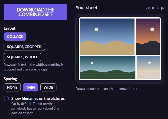
Three layouts, and the one to reach for first
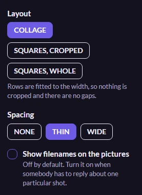
Collage is the default and usually the right answer. Each row of pictures is scaled so it fills the width exactly, which means nothing is cropped, nothing is padded, and there are no gaps — rows simply come out at different heights, and that is the trade that removes the empty space. A set of mixed portraits, panoramas and squares lays out as a collage with no effort at all.
The other two make every picture a square, which is what a profile grid or a tidy proof sheet wants. Cropped trims the long side of each frame from the centre; whole puts the entire frame inside the square and leaves space around it. Cropped is the neat one and loses the edges; whole shows you everything and spends the corners. Only these two offer a column count, because a collage works its own rows out from the shapes it was given.
Spacing sets both the gaps between pictures and the margin around the whole sheet, so turning it off gives an image that runs to its own edges. Filenames are off to begin with, which is right for anything that is going to be looked at or posted — a name written under every picture is clutter there. Switch them on when the sheet is going to somebody who has to reply about one particular shot, because a name is what lets them say which. Long ones are shortened from the middle, since the identifying part of a camera filename is at the end.
Moving a picture, recentring it, and what comes back
Pictures appear in the order you handed them over. Drag one onto another in the preview and the rest shuffle along to make room — it moves rather than swaps, so dragging the last shot to the front pushes everything down by one instead of exiling whatever was there. In the cropped-squares layout, dragging a picture around inside its own square slides the crop instead, which is how you rescue a portrait whose head the centre crop took off. Which of the two happens is decided by where you let go: stay inside the square and you have recentred it, leave it and you have moved it. On a touchscreen, press and hold a picture first — otherwise a swipe across the sheet is just a swipe, and the page scrolls as it should. One button puts everything back.
The file itself is one JPEG, named after the first picture in the set with a count in it, so two sheets from two sessions do not collide in a downloads folder. It is always built on white, whatever theme you are reading this in: a sheet is something you send — to a client, into a bug report, at a printer — and a dark image arriving because of how somebody's browser was configured that afternoon is a surprise at the far end.
Nothing extra is uploaded to make it. The compressed versions were already fetched back to build the table, so the sheet is painted in your own browser out of bytes that are already there, and the assembled file never leaves your device.
Worth knowing
If you wanted a print rather than a proof
This is built at a size meant for looking at. A sheet of twenty fills a page comfortably and will not survive being enlarged much past that, because each thumbnail is a reduced copy to begin with. If you need print resolution, put fewer pictures on each sheet and make several — six across a page at four times the size is a different document from twenty at a glance, and both are legitimate.