 Free Online Image Optimizer
Captioning a picture, and why the lettering behaves the way it does
Two lines of white capitals with a black keyline is a format almost everyone can read without being taught. It survives being shrunk to a thumbnail in a group chat, it survives a bad screenshot of a screenshot, and it works on a photograph of anything. This walks through putting those two lines on a picture of your own, and explains a few decisions that are visible on screen but not obvious.
Bring a photograph, or begin with an empty card
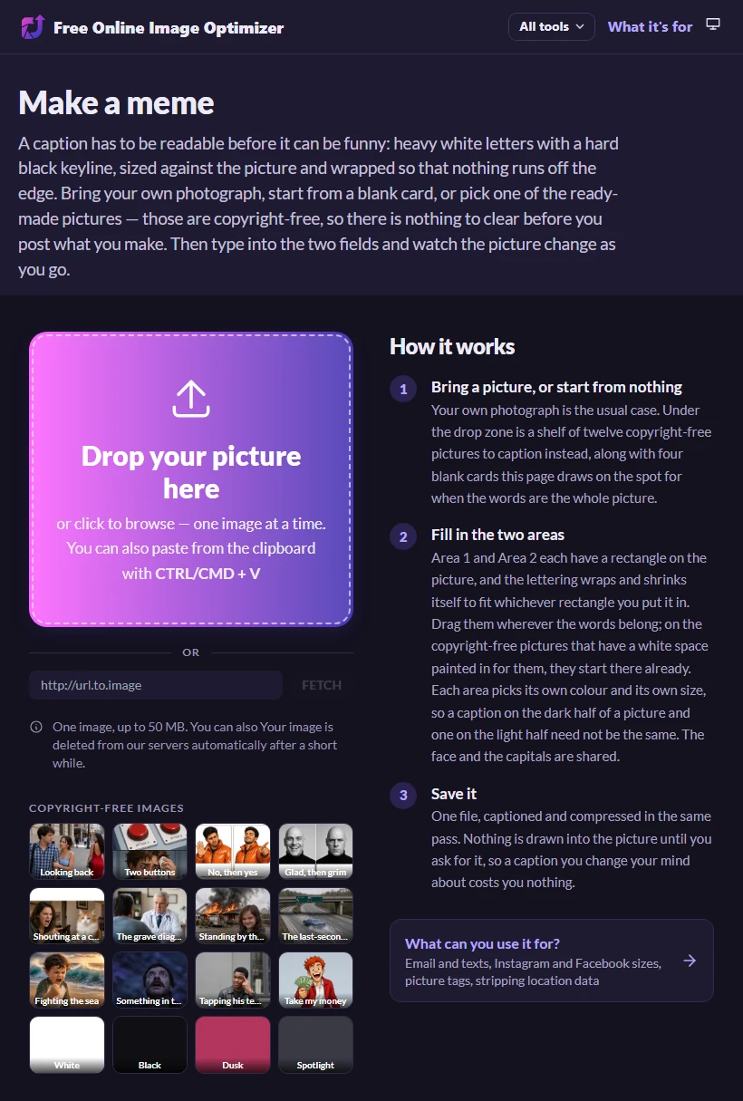
The page is at Make a meme, and it opens on a drop zone with a row of small coloured squares beneath it. The drop zone is the usual route: a photograph off your phone, a screenshot, anything the rest of this site accepts.
The squares are the other route. Each one is an empty card that your browser paints on the spot when you click it — plain white, plain black, a gradient, a soft spotlight. They are there for the times when the words are the entire idea and a photograph would only get in their way.
Under those is a shelf of twelve pictures you can caption instead. They were generated rather than photographed, and none of them is a copy of an existing image — which is what lets them sit here at all: a picture the site chooses and serves is the site's own doing, without the shelter a picture you brought yourself would have. Click one and it goes onto the stage exactly as your own photograph would.
What you will not find is a shelf of film frames and television stills to pick from. Sites built around that shelf are relying on their users having uploaded the frames, which puts the pile inside a takedown regime rather than inside a licence. Choosing the pictures ourselves would be a different act with a different answer, so this page draws blanks and takes yours.
The two fields, and watching them settle
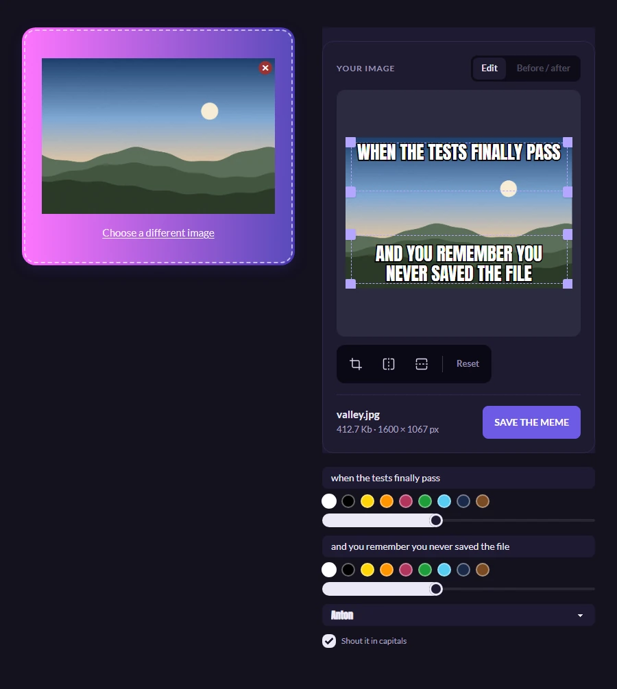
Once a picture is staged you get two fields, Area 1 and Area 2. They are not called top and bottom because either can be anywhere; the names just say which rectangle on the picture each one fills. Either can be left empty. Type into them and the words appear on the picture immediately, in the place and at the size they will actually be drawn.
That immediacy is worth knowing about, because it means you can try a phrasing, look at it, and try another without anything being processed in between. Nothing is written into the picture until you ask for the file — up to that moment the words are laid over the top of it, which costs nothing and can be undone by deleting them.
Watch what happens as a line gets longer. It reaches the edge and breaks onto a second line rather than running off the side, and if it keeps growing the whole block gets smaller until it fits. Four lines is as far as it will wrap; past that it carries on shrinking instead, on the grounds that five lines across a photograph has stopped being a caption.
There is a checkbox to shout the whole thing in capitals, and it starts unticked. Heavy capitals are the convention, but they are not always the joke, and a tool that rewrote what you typed the moment you typed it would be the wrong way round. The field keeps your own text either way, so switching the box back and forth costs you nothing.
Underneath each field are nine colours and a size slider, and they belong to that area alone — a caption on the bright half of a photograph and one on the dark half are rarely the same colour, and a long line beside a short one is rarely the same size. The typeface and the capitals are shared between them; there are nine faces to choose from. Anton is the default and is the nearest free relative of the one everybody pictures; there is also a condensed poster face, a heavy grotesque, a cartoon hand, a serif, and a typewriter for when the joke wants to look like something that came off a machine.
Putting the words somewhere else entirely
The top and the bottom are where captions go, and for most pictures that is the end of it. Sometimes it is not: the face you are captioning sits in the top third, or there is a patch of empty sky the words would land on perfectly, or you want one line down the side and nothing across the middle at all.
Each area already has a rectangle on the picture, dashed, with a handle at each corner — the same handles as choosing which part of a photograph to keep, and they behave the same way. Drag one bodily, or pull a corner to change its shape. There is nothing to open first and nothing to accept afterwards.
What happens as you drag is the part worth understanding. The words are fitted inside the rectangle rather than merely moved to it, and they are re-fitted on every movement while your finger is still down. Pull a corner inwards and watch a line that fitted across the whole picture break into two, then three, shrinking as it goes. Let go somewhere else and it grows back. The rectangle is a shape rather than a position, and dragging that shape is how you decide what the caption looks like.
Until a rectangle is touched it stays automatic, and automatic is not the same as a rectangle that happens to sit at the top: it is worked out from the picture's own proportions each time, so it survives cropping afterwards. Reset, on the same row as the crop and flip tools, puts both captions back to it without disturbing the words you typed.
Asking for the file
The button underneath says to save the meme, and that is the point at which the lettering is drawn into the picture rather than sitting over it. Your browser does the drawing, on a canvas, before anything is sent anywhere; what goes up afterwards is a picture that already has the words in it, and it goes up to be compressed like every other file this site handles.
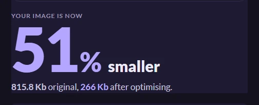
You get one JPEG back, along with a figure for how much smaller it came out. A captioned photograph tends to compress much as the photograph did, because flat areas of solid lettering are cheap to store — the saving you see is mostly still about the picture underneath.
If you meant to change a word, the picture on the stage is still there and still editable. Type the correction and press the button again.
Worth knowing
Why the letters are Anton rather than Impact
Impact is the face people picture, and it is offered in the list. The trouble is that it ships with Windows and with macOS and with almost nothing else: on an Android phone, on an iPhone, on most Linux machines, a request for it quietly lands on an ordinary sans and the picture stops looking like what you meant. Anton is close in shape, free, and fetched by the page itself, so it looks the same wherever it is opened.
The preview is not an approximation
Where each line breaks is worked out once and handed to both the picture on screen and the file being written, so the two cannot disagree. That sounds like a small thing until you have downloaded something whose second line turned out to sit somewhere else entirely.
One picture at a time
Where the words belong is a judgement about the particular photograph in front of you, which is why this page takes one rather than a folder. If what you want is the same treatment applied to a set, that is closer to a watermark, and there is a page about that.