 Free Online Image Optimizer
Darkening a photograph so text can sit on it
White text over a bright photograph is the most common readability failure in web design, and the usual response — make the font bigger — does not help, because the problem is contrast rather than size. Putting a dark wash over the picture does help. This walks through it, and through judging how much is enough.
Why a bigger font does not fix it
Text is readable when it differs enough in brightness from what is behind it. A photograph is not one brightness: it is a thousand of them, and a headline crossing a bright sky and a dark hillside is legible over one and invisible over the other. Enlarging it makes the illegible half bigger.
Darkening the whole picture compresses its brightness range downwards, so white text has something consistent to sit against everywhere. It costs some of the photograph's punch, which is the trade.
The tool is at Darken an image.
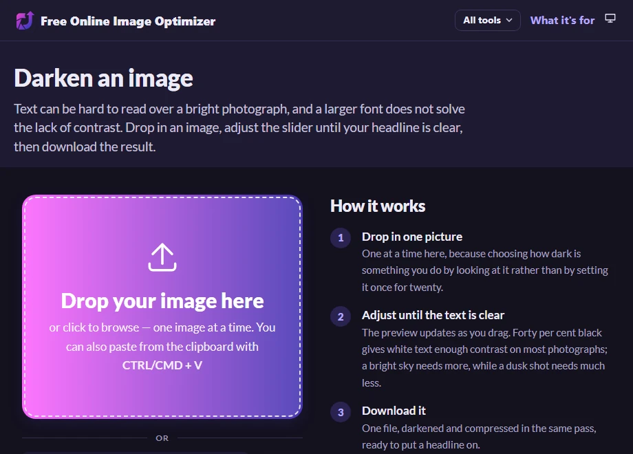
Drag until the text would be clear
The stage updates as you drag, so this is a decision you make by eye rather than by number. Forty per cent black is the starting position and is about right for white text on a typical photograph; a very bright picture, or a picture with a lot of pale sky where your headline will sit, wants more.
The darkening you see on the stage is done in the browser for the preview and burned into the pixels when you download, so what is on screen is what you will get.
It is one picture at a time on this page. That is deliberate: choosing how dark is something you do by looking at the result, and there is no sensible way to do that for twenty pictures with one slider.
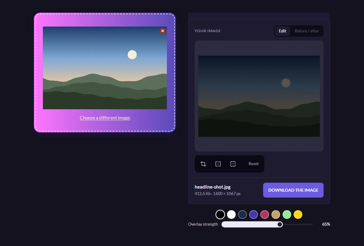
Take it, then test it with real text
One file, darkened and compressed in the same pass, ready to put a headline on. The button hands it straight over, and the table underneath holds the single row — one image in one format is one version.
A tip worth the extra minute: put your actual headline over the result before you commit to it, at the size and font you are going to use. The amount of darkening that looks right on a bare photograph is often a little short once real text is on it.

Worth knowing
It does not have to be black
The wash colour can be changed in the settings. A dark tint of the brand colour, or a deep blue over a cold photograph, often looks more deliberate than flat black — the effect on readability is the same as long as the wash is much darker than the text.
A transparent PNG
The output here is JPEG, which has no transparency, so a picture with a transparent background comes back with that area filled in. For a picture that needs to stay transparent, darkening it here is not the tool.
The other way to solve it
Darkening the whole picture is the blunt instrument, and it is often the right one. The alternative is a gradient behind the text only, so the rest of the photograph keeps its brightness — that is a job for CSS on your page rather than for a change to the file, and if you have the choice it usually looks better.